A ( wild ) mind calls
for creative solutions

GasBuddy
Helping you save, one pit-stop at a time
Project Scope
UI Design – Graphic Design – UX Prototyping – User Research – Usability Testing
Category
UI & UX Design
Year
2020
Timeline
10 Weeks
In my UX Design course during my Bachelor’s program, we were tasked to redesign a travel app of our choosing; learning to design, construct, and research how applications operate visually (UI) and operationally (UX).
I chose to focus my project on the company GasBuddy; a tech company that operates apps and websites based on finding real-time fuel prices at more than 140,000 gas stations in the United States and Canada.
The Challenge
Upon download and usage, the problem became clear for which I would base my redesign and user experience reconstruction around; intuitive navigation and effective use of screen real estate. Both of these issues were prominent and clear on the ‘Home’ menu alone; an app designed and created to showcase and provide local, up-to-date gas prices was nowhere in sight.
Design Goals
The number one goal I had for this app was “Don’t make me think!”
I wanted to work on a redesign for GasBuddy to aid in simplifying, refreshing, and adjusting the app to be, most importantly, intuitive and user friendly. The interface is currently cluttered on specific interfaces, and too empty on others. Creating a more cohesive look, and usability across the application, as well as company (ie. website) is crucial for its success and implementation in user’s daily lives. With all that considered, it was important to note that hierarchy of information, redundancy of certain CTA’s, and visual graphical design were all in high demand for a redesign.
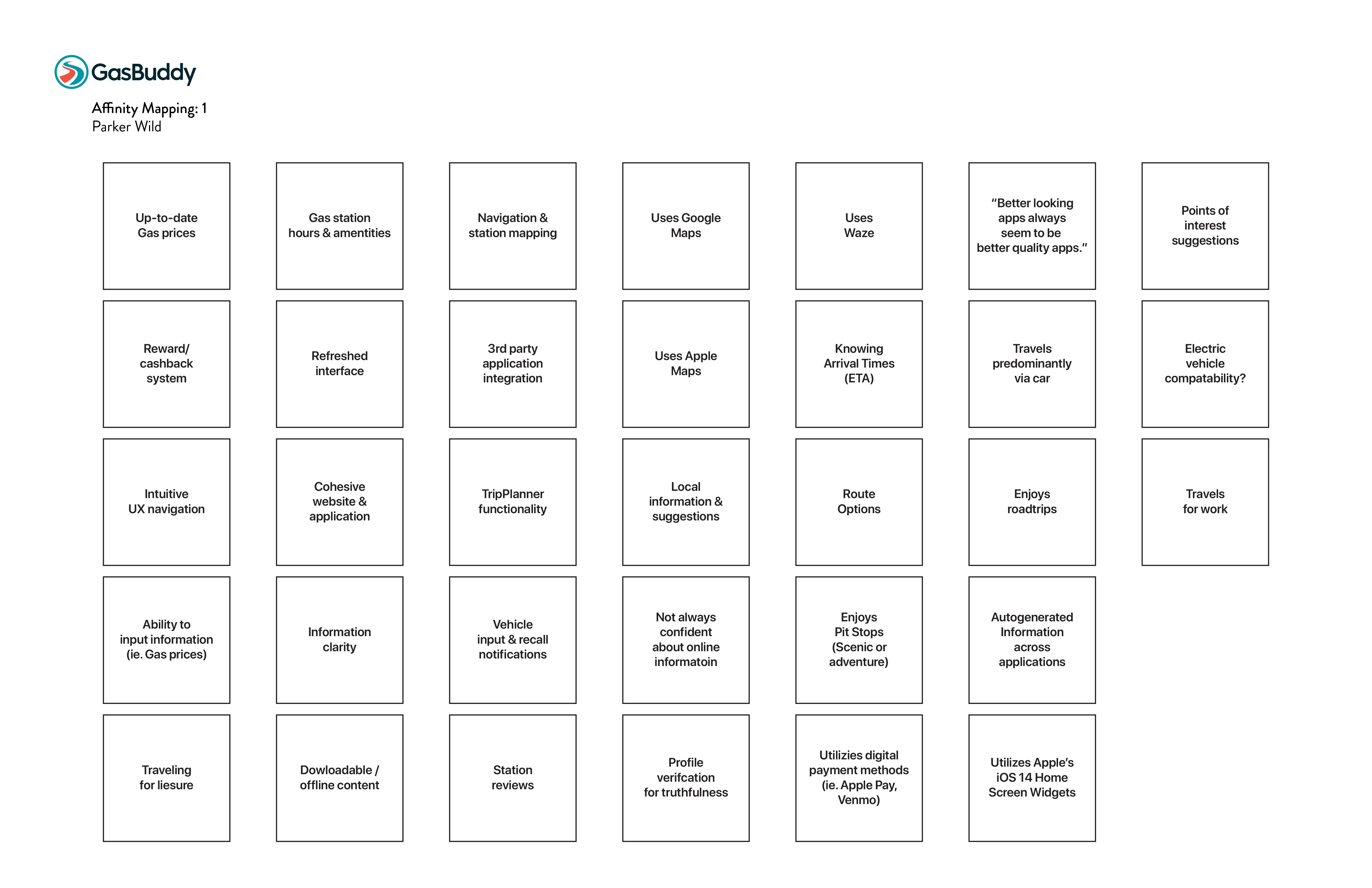
The Affinity Mapping process was a way for me to quickly, and without bias, prioritization, or purpose, write down any and all concerns, goals, issues, or details I noticed would become important to evaluate for pinpointing my MVP.
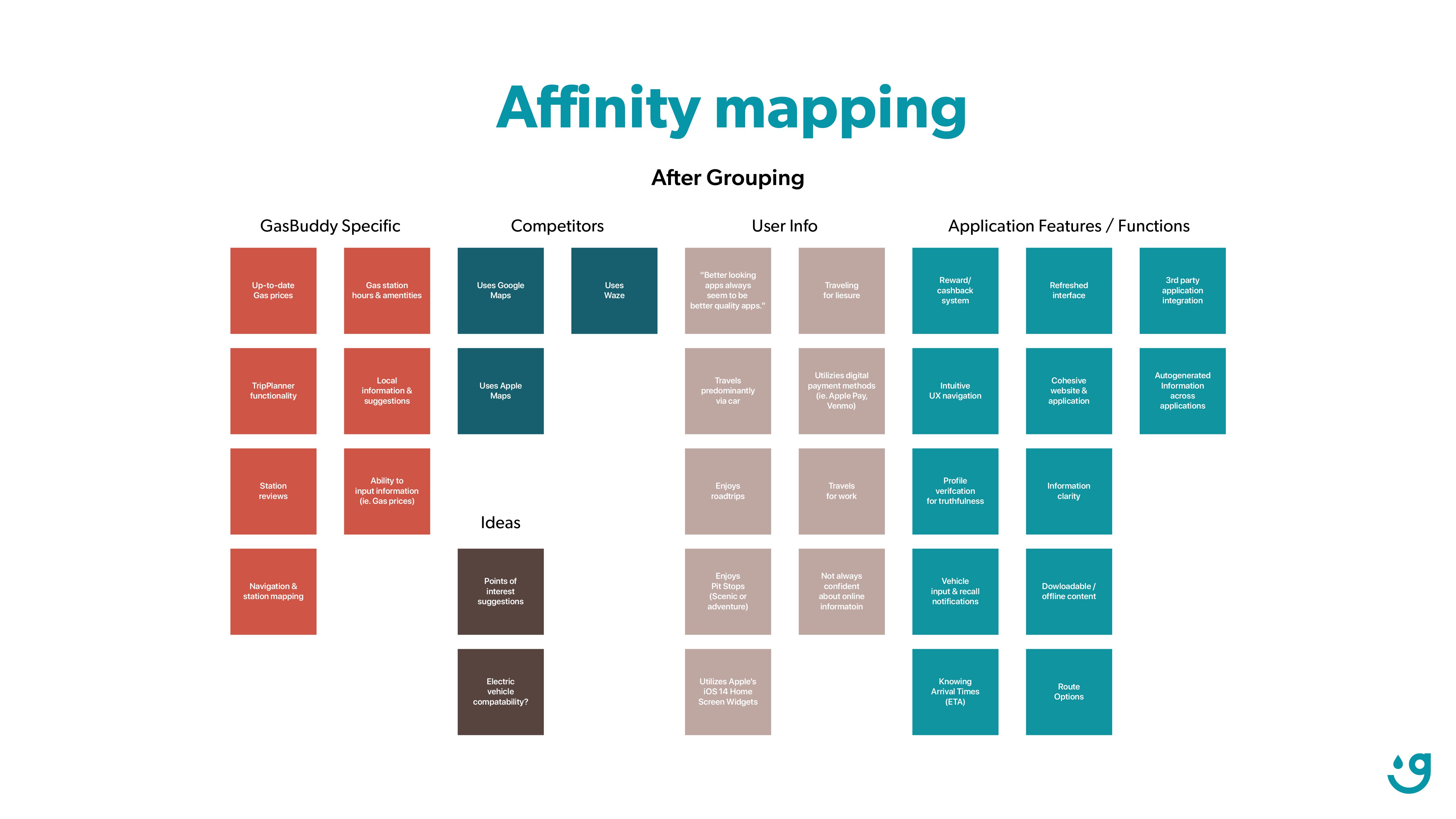
Afterwards, I grouped together all of my "digital stickies" to better identify where each idea fell within the segments of the project. This also helped identify which areas needed the most work, which groups maybe be priority regardless of numbers, or which were not-as-important as I once believed.
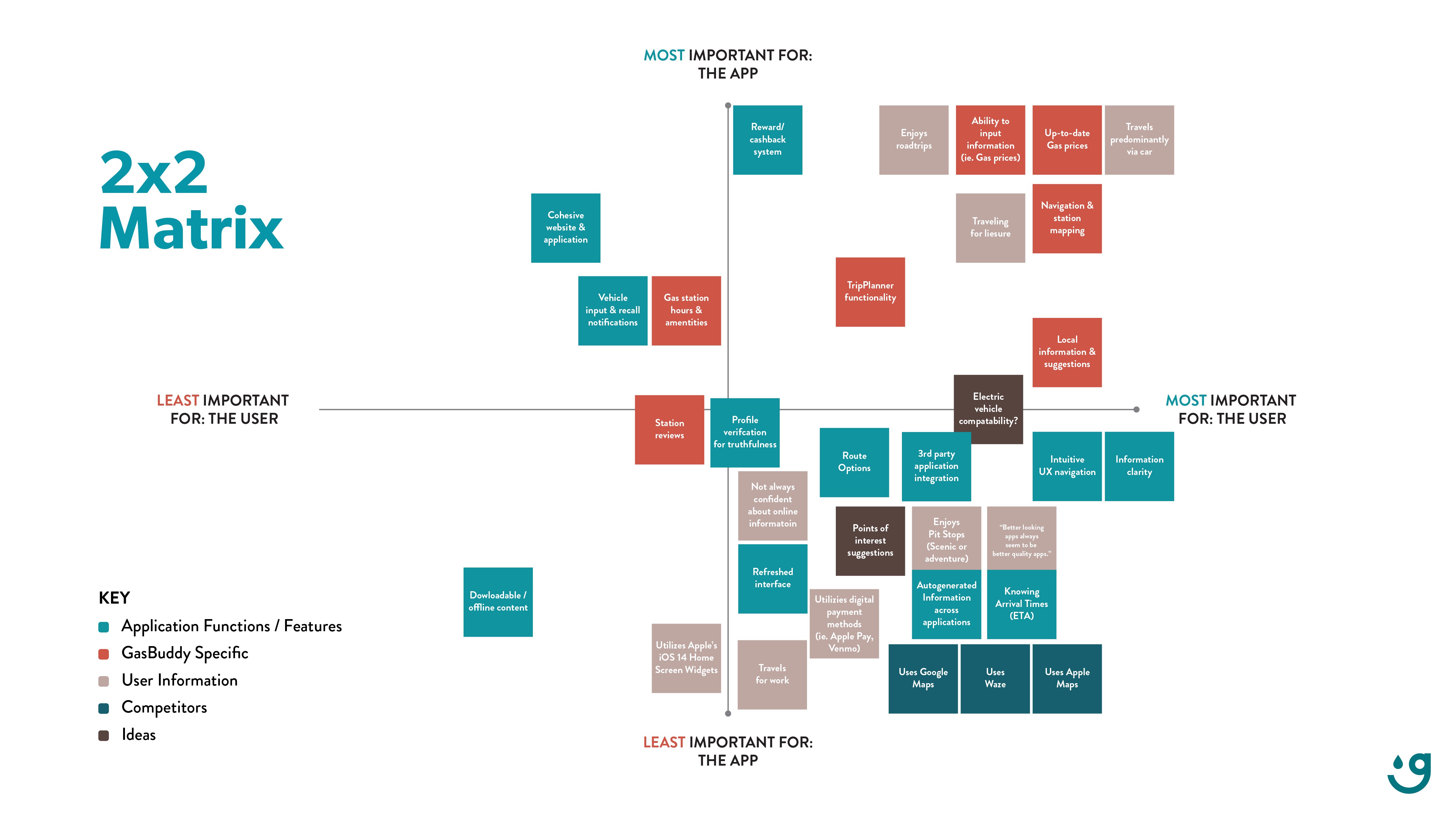
The last step was to graph my findings on axis' important to the user, and then to the app and GasBuddy company itself. From here, my MVP would become clearer, aiding in the director of my UX reconstruction and UI redesign.
USABILITY TESTING
Critiques
No option to name a trip in the "Trip Planner" page
Ability to override GasBuddy's vehicle information for trip and gas consumption calculations
Hierarchy of home screen information organization
Would like to have time stamp and user name tags displayed for gas price reports
Notable Observations
No hesitation or inability to perform Task #2 (MVP Specific: Find gas prices for Chevron station)
Appreciated clean design, compared to current GasBuddy UI
Design Changes
Replaced Hamburger menu icon with 'person' icon for better clarity
Added ability to name a trip in the "Trip Planner" page
Reorganized home screen information hierarchy to display most important information first
Added user information and time stamps to all gas station listings
Added drop down menus for editable vehicle information in the "Trip Planner" page
Added more consistent headers to most pages
Added the "Map" button for station viewing from the current GasBuddy UI on "Find Gas"
Added additional settings in the "My Account" page for further customization and control

THE TASK
The logo was another assignment in our redesign project, prompted at elevating and refreshening the current branding.
THE GOAL
Soften the logo to be more "friendly" and "buddy". Create a new icon that holds meaning to the application with symbolism. Experiment with color as well, but stay on brand.

LOGO DESIGN IDEATION
The new logo I wanted to design was built on the incorporation of a few factors; unlike the current logo, I wanted to stray from any 'road' association. Not all users utilize GasBuddy for roadtrips, some use it solely for discounted savings; and a visual representation of savings and discounts is "happiness" or a "smile".

COLOR EXPLORATION
The current logo incorporated two brand colors, for which I explored incorporating in different ways. In version one of the redesigned logo, it felt like the red and blue were competing; there was a larger majority blue, however the harshness of the red felt challenging.
Version two of the logo explored what an analogous logo would look like, if both the typographical logo and mark icon were both a shade of the GasBuddy blue. This ended up becoming the final logo.
Version three was the opposite of version two, where instead of the blue, the GasBuddy Road Red was utilized. This color theory behind this logo felt too strong, aggressive, and intimidating. Definitely not “friendly” or “buddy-y” like I had initially wanted.
CURRENT UI
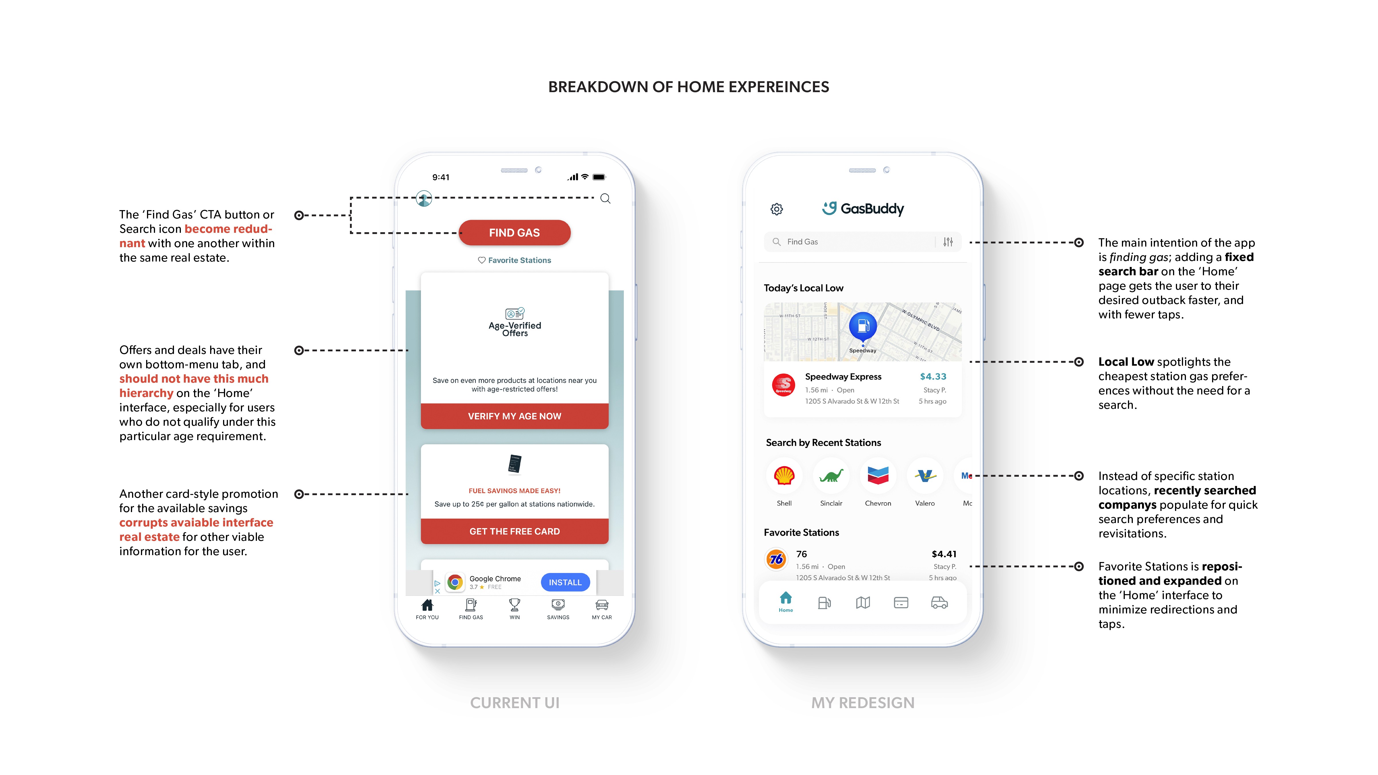
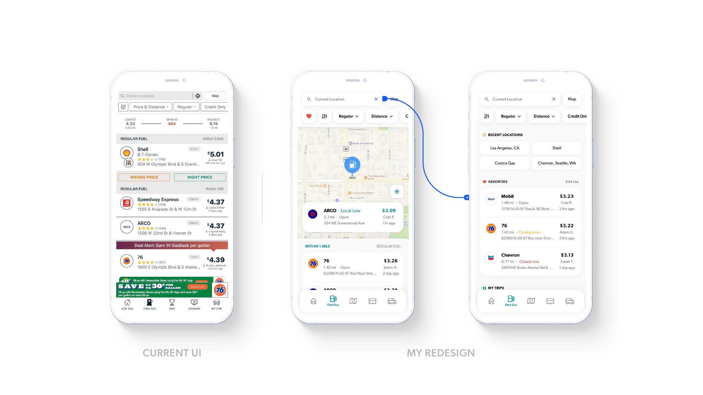
The current UI of GasBuddy pushes the different available deals and savings the company offers outside of the main price-searching functionality. The ‘Home’ interface is cluttered with repetitive redirection buttons, along with unnecessary cards promoting information other than gas prices, stations, or possible monetarily-driven savings.
MY REDESIGN
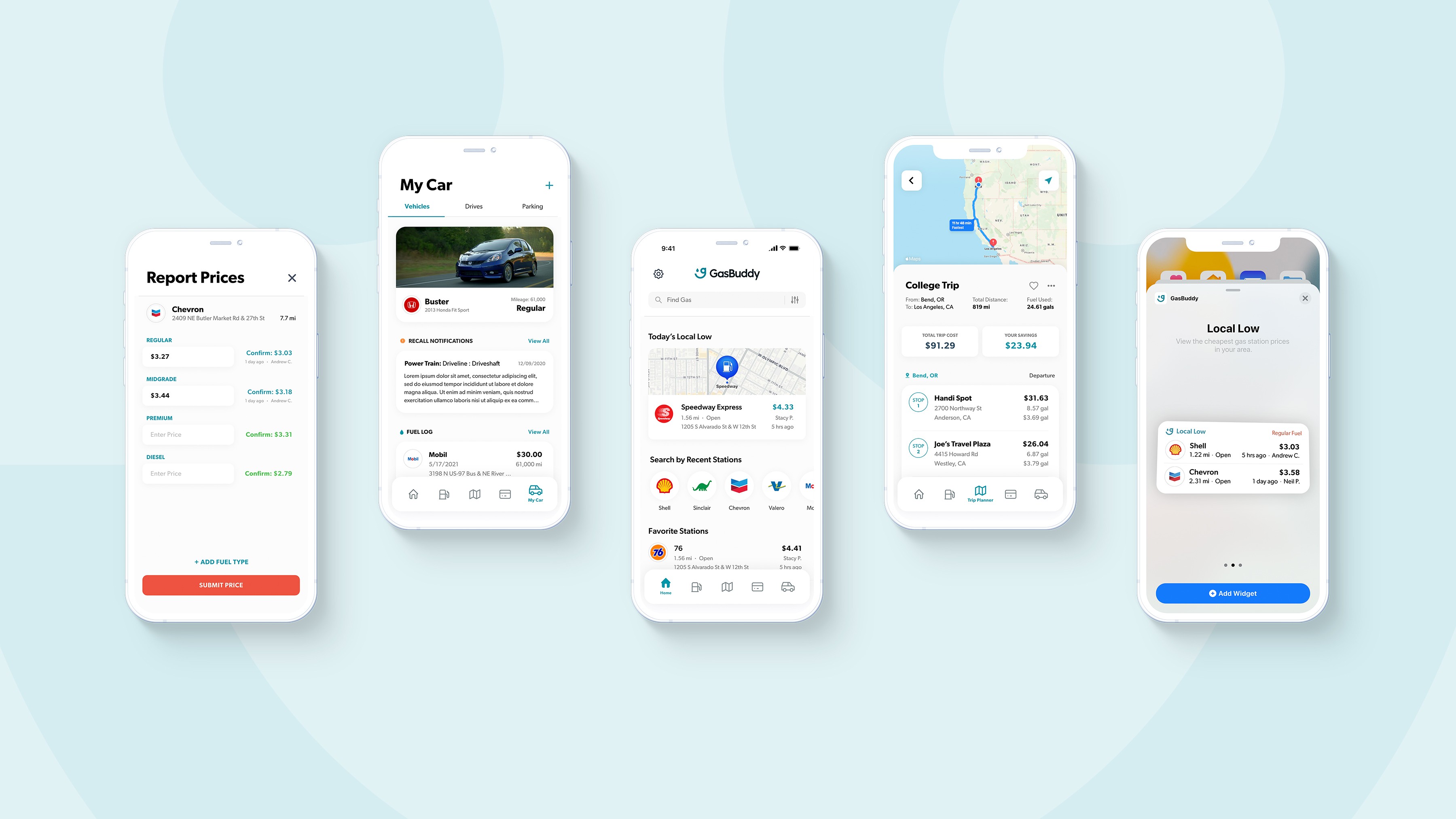
After evaluating the elements on GasBuddy’s current ‘Home’ interface, it was clear that a reorganization of content alone was not the right approach; instead a full redesign was necessary. My redesign focuses on bringing elements from other interfaces to make the ‘Home’ interface as usable as a one-stop-interface incorporating many of the potential users needs.
NAVIGATION MENU
Trip Planner
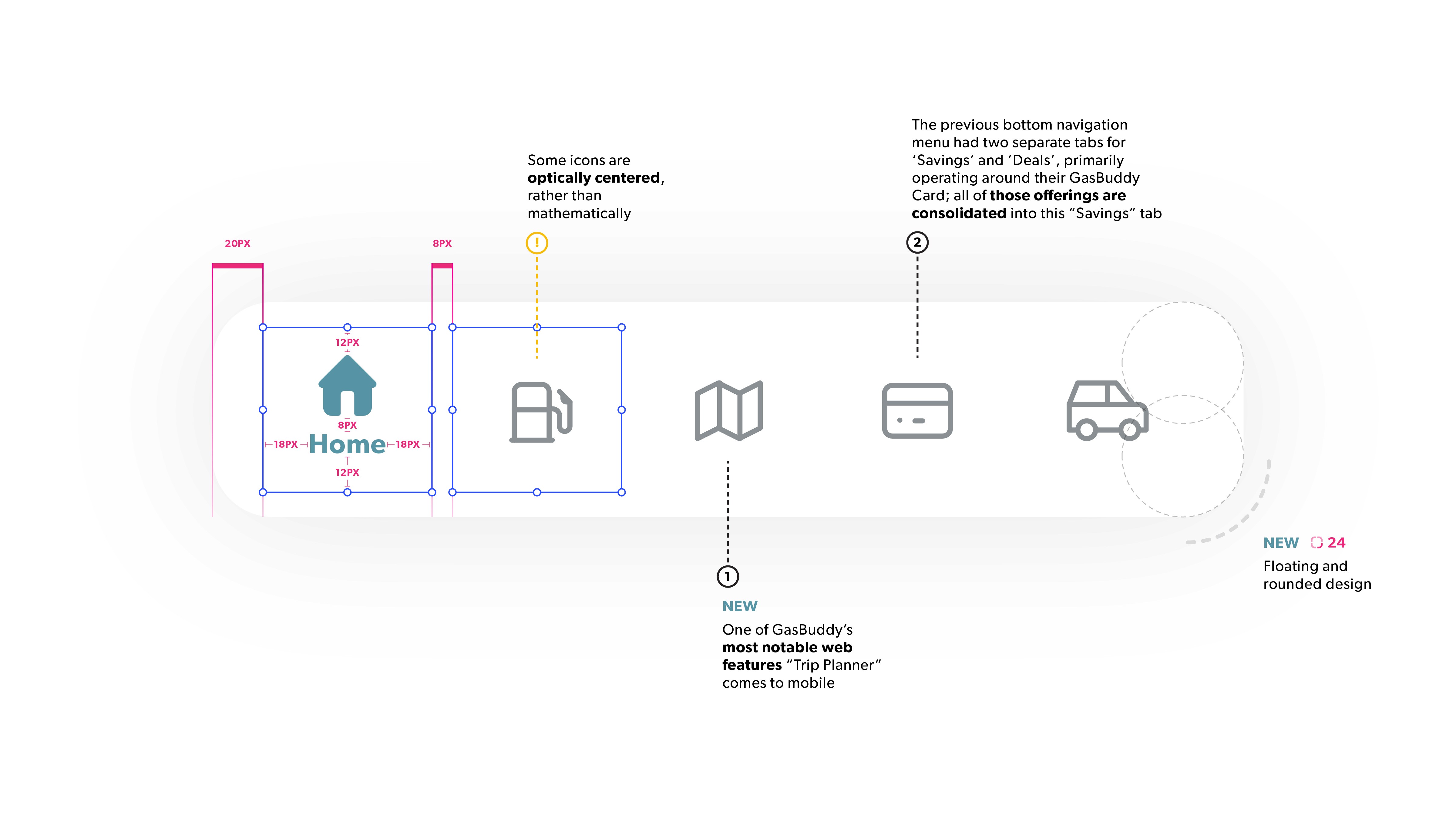
From those surveyed who were familiar with GasBuddy, a majority knew about the company solely alone from their web-feature “Trip Planner”; a tool which I go into more detail later in the case study. This feature alone was a main goal for design and implementation during my redesign, and considering its popularity, felt appropriate to have a place in the navigation menu.
Savings
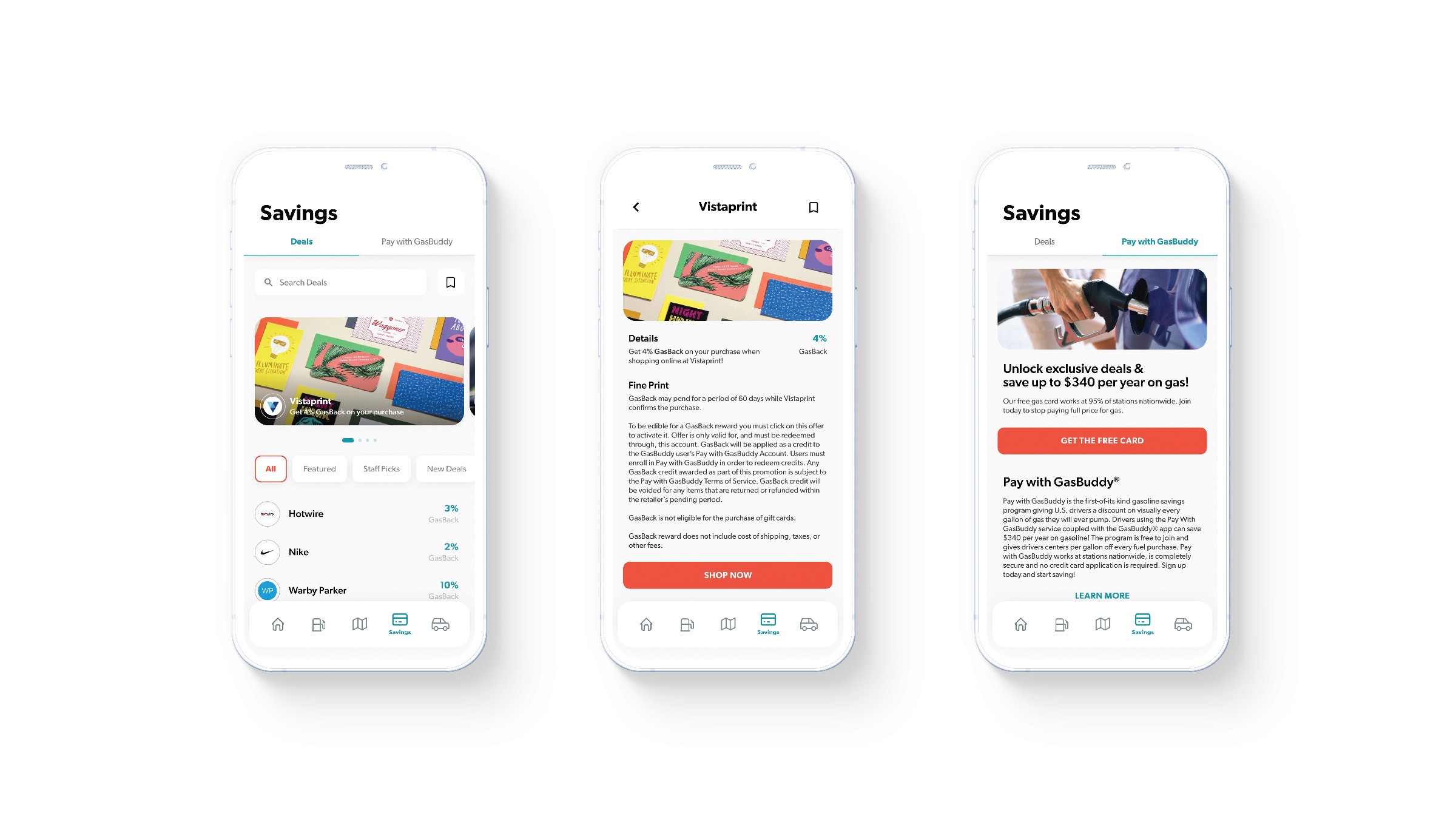
The bottom navigation menu was another important area for redesign when analyzing the problem-areas surrounding the current app’s design. To start, there were two separate tabs dedicated for ‘Savings’ and ‘Deals’; one goal of mine was to consolidate these tabs and respective information into one menu option appropriately titled “Savings”
GAS PRICES
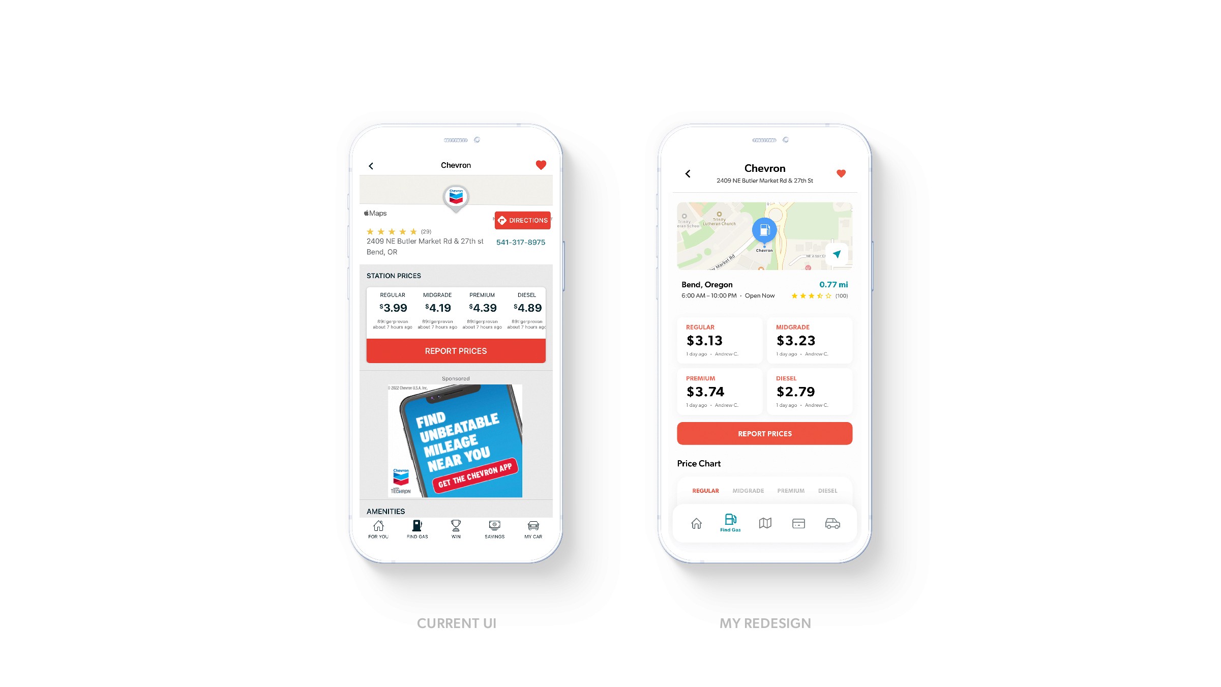
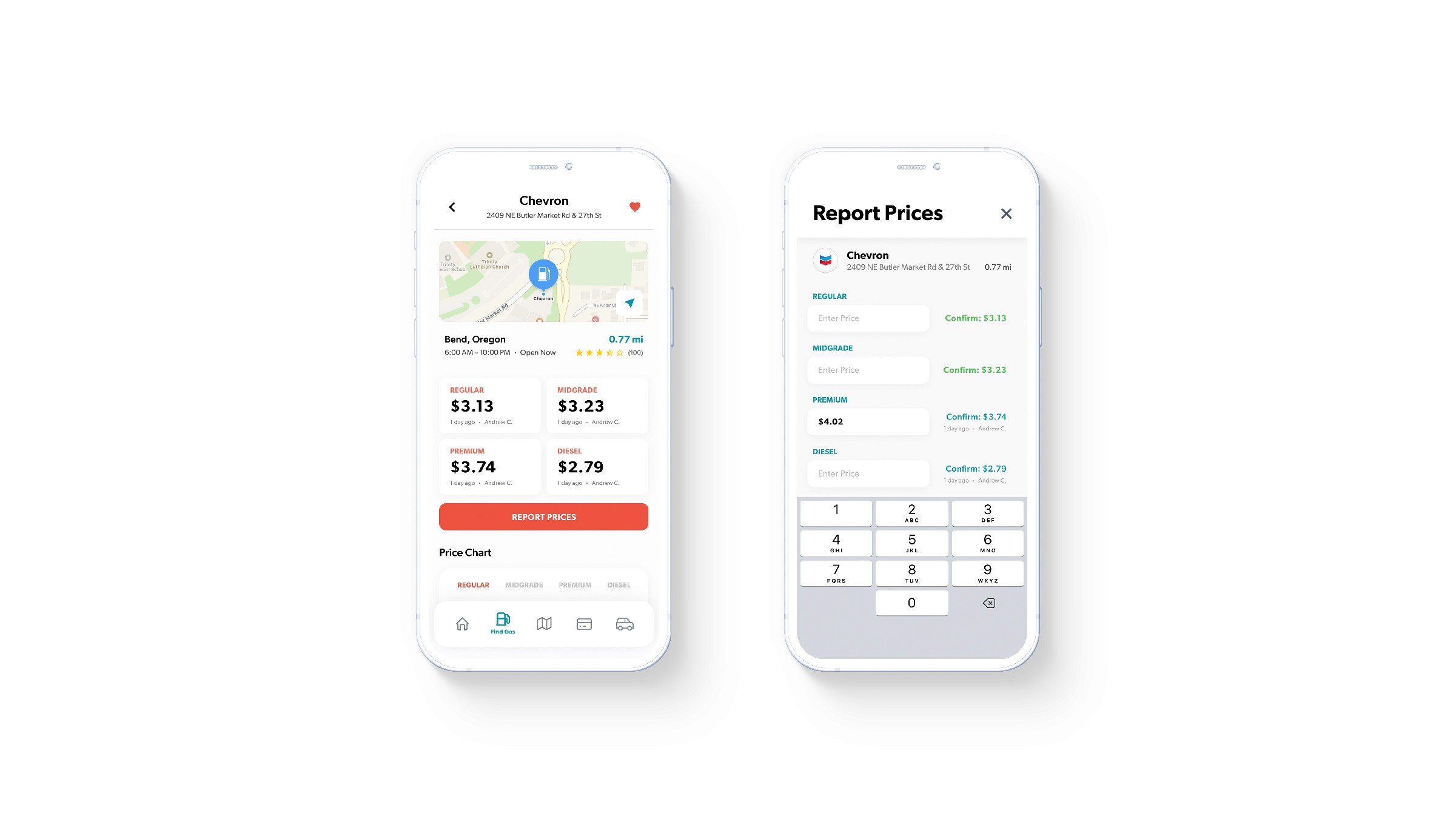
Within the current design of GasBuddy, the interface for a gas station, presenting the relative gas prices, is cramped and requires additional scrolling to find imperative information (ie. additional fuel types if more than 4, as well as map visuals)
REPORTING PRICES
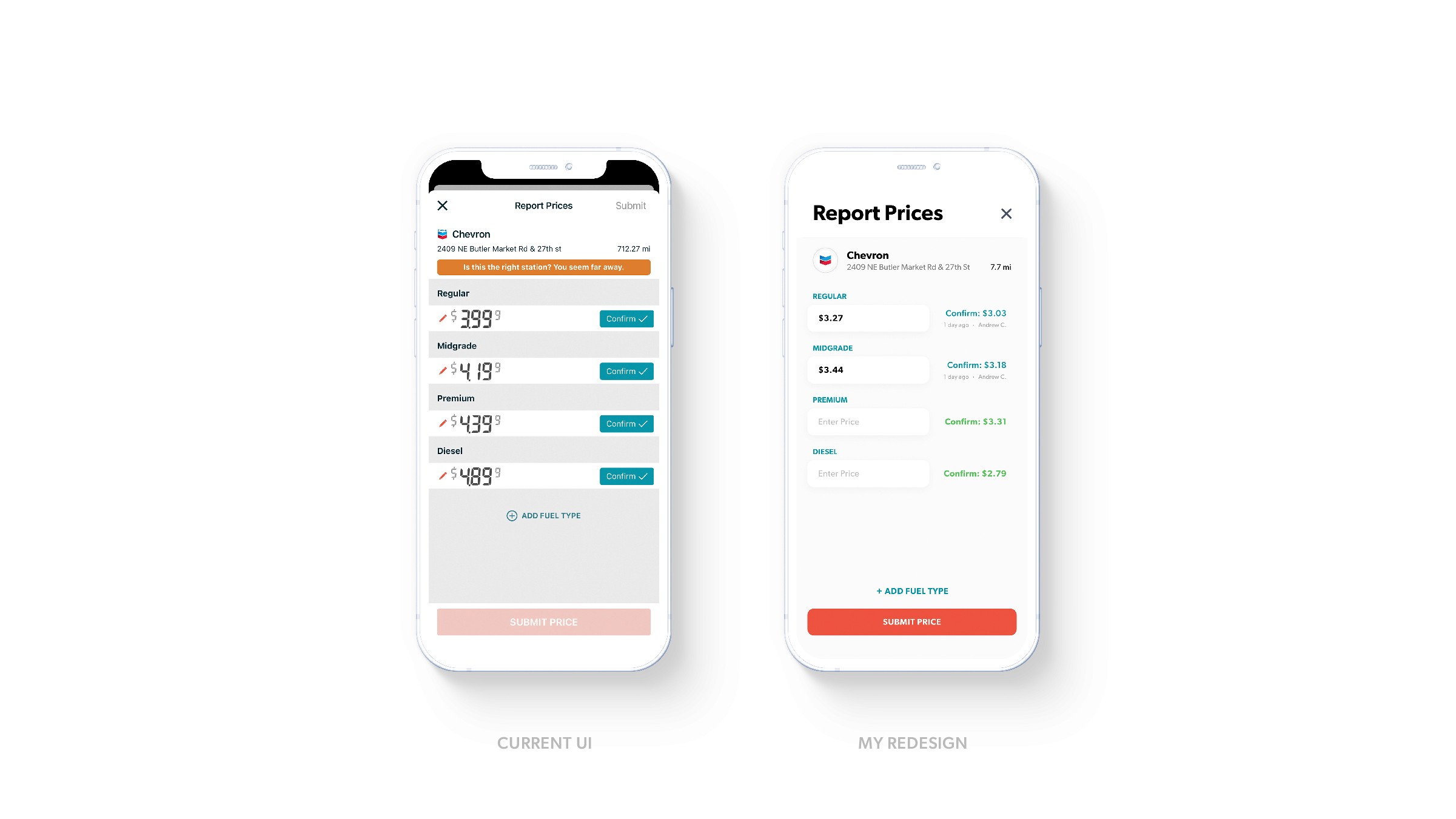
GasBuddy operates and depends on consumer-driven input. When updating or confirming prices within the current UI, there is no time stamp as to how recent the prices may be.
Introducing
TRIP PLANNER
Remember that web feature I spoke about up above? This is the brand new, mobile-friendly “Trip Planner” function apart of the redesigned GasBuddy application.
Here, mirrored just like the websites functionalities, users can plan roadtrips or drives by inputing beginning and ending locations, fuel preferences, and vehicle information like make and model (for the best accurate spending and savings calculation).

You can plan trips and save them for later, or schedule a time and date for future reminders. View informational breakdowns of stations fuel-ups and quantity amounts for the best savings. Edit your trips, share with others, and download their itineraries for off-the-grid adventures.
ONBOARDING
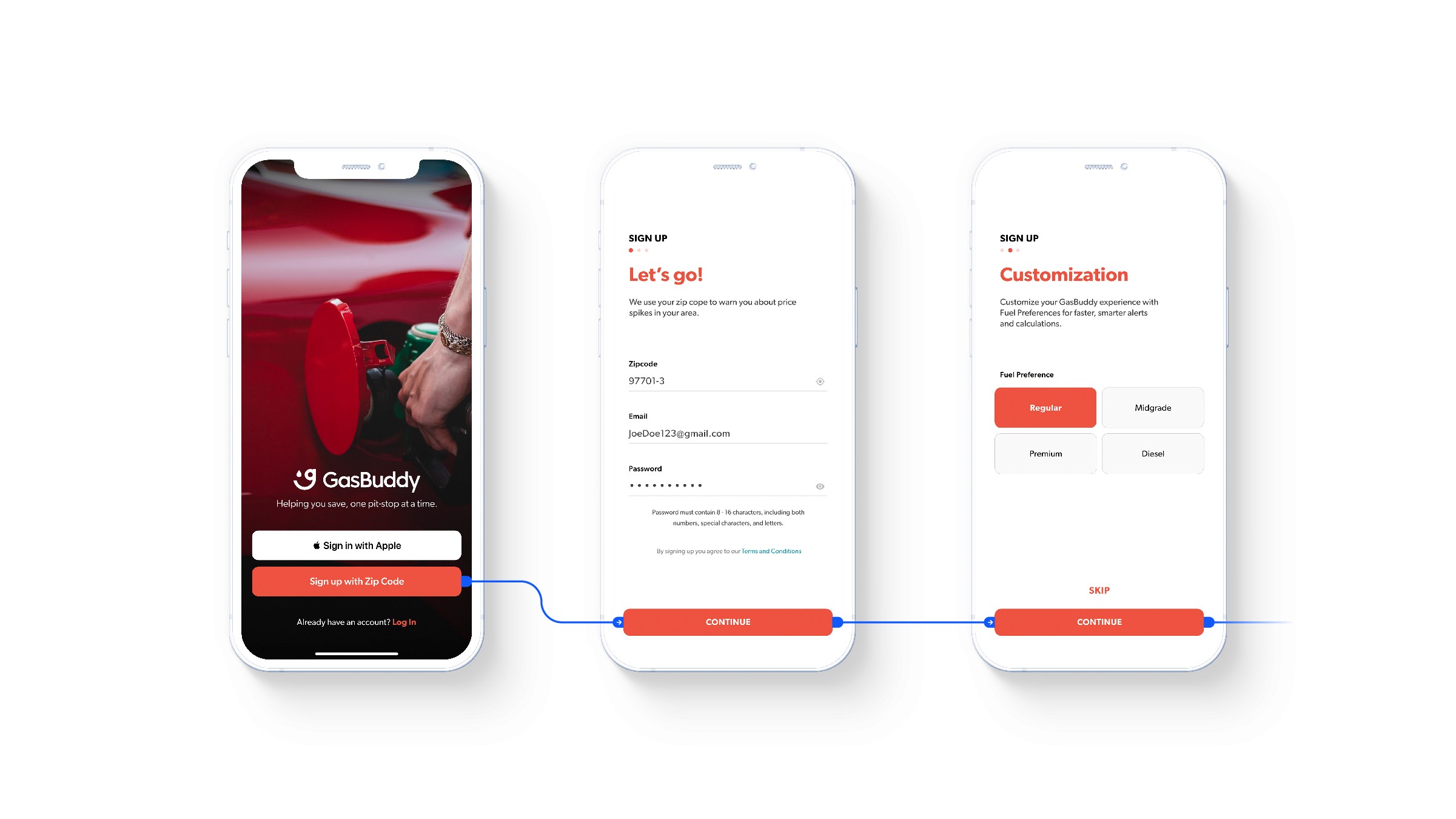
The reconstruction of the onboarding process was centered around the idea of gathering as much information from the user once so that application usage is as accurate without additional prompts or information inputs.
Many users may not want to create an account or take the time to sign-up. However, if users are going to need to input a zip-code regardless, why not allow them to customize their settings upon download, such as fuel preferences, vehicle input profiles, and ‘Pay with GasBuddy’ promotional offer sign-up, so that the following usage of the application doesn’t require another pop-up or customization process.
SEARCH
Find Gas with ease with filtered search options, such as distance, fuel type, and payment types. Local Low is prominent for the cheapest gas at a glance. The most important information is also now front and center with each station and search result, like operating hours, price and recency, distance and address.
SAVINGS
The savings portion of the application received a full make-over as well, with larger images, a bookmark and save function, and a clearer, more defined organizational layout of information and promotional marketing. GasBuddy offers a lot of benefits with their ‘Pay with GasBuddy’ program, and it was important to still sell the perks of the program, just moved and highlighted in a different, more appropriate setting.
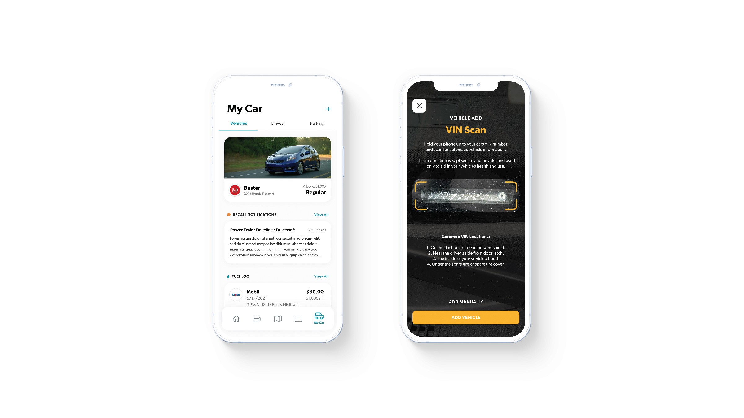
VEHICLES
Hierarchy of information has again been adjusted with the ‘My Car’ menu, with recall notifications now second to your vehicles profile card. The fuel log helps add information to your vehicles chart, tracking mileage and gas usage. Adding additional logs can also be accessed from ‘Home’.
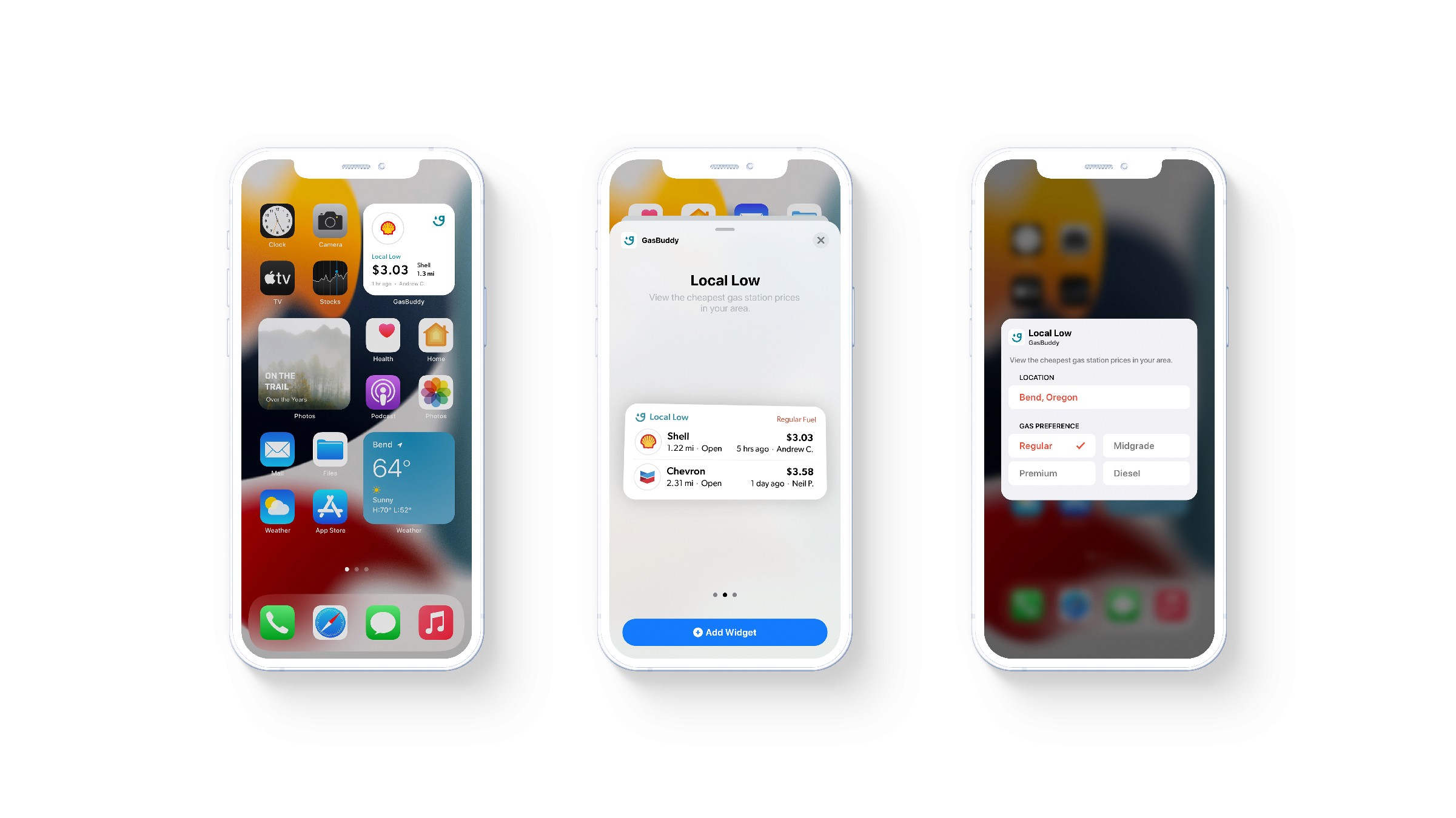
iOS 14 WIDGETS
Apple's iOS 14 introduced the new and fun way to personalize your iPhone's home screen with widgets. These completely redesigned the home screen and how users viewed and received information.
I wanted to provide GasBuddy with their own iOS 14 widget for convenience at a glance. My ‘Local Low’ felt like a perfect and appropriate feature to highlight for a widget complication like these.