A ( wild ) mind calls
for creative solutions
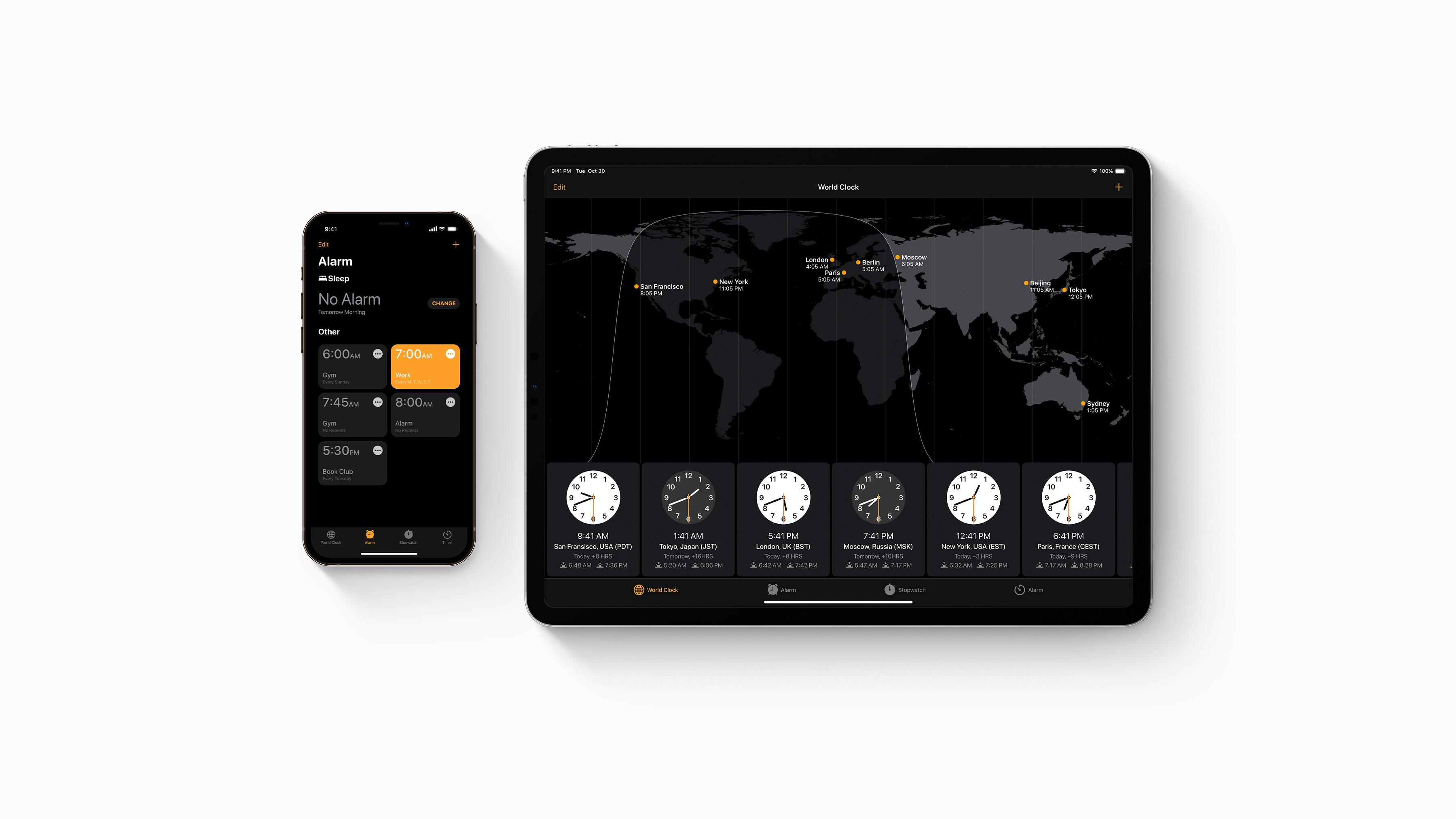

iOS Clock Redesign
Redesigned for the rested
Project Scope
Category
Year
UI Design
iOS Concept
2020
Sleep easy knowing your alarms have your back. Through ongoing efforts, and an obsession with simplifying everyday tasks,, this redesign concept explores what a grid-like, searchable, and customizable clock interface could feel like.
The Challenge
If you’re anything like me, you have what feels like a mile-long list of alarms in your phone, all varying by five minute increments. Readjusting my “Wake Up” and “Sleep Schedule” nightly to accommodate my never-consistent work schedule and lacking workout regiment came to a frustrating halt one night after changing it for the fourth night in a row. The convenience of my HomePod Mini made voice activating my alarm quick and simple, but I preferred the reassurance of clicking my alarm toggle to ‘on’ and seeing the visual indicator switch to green.
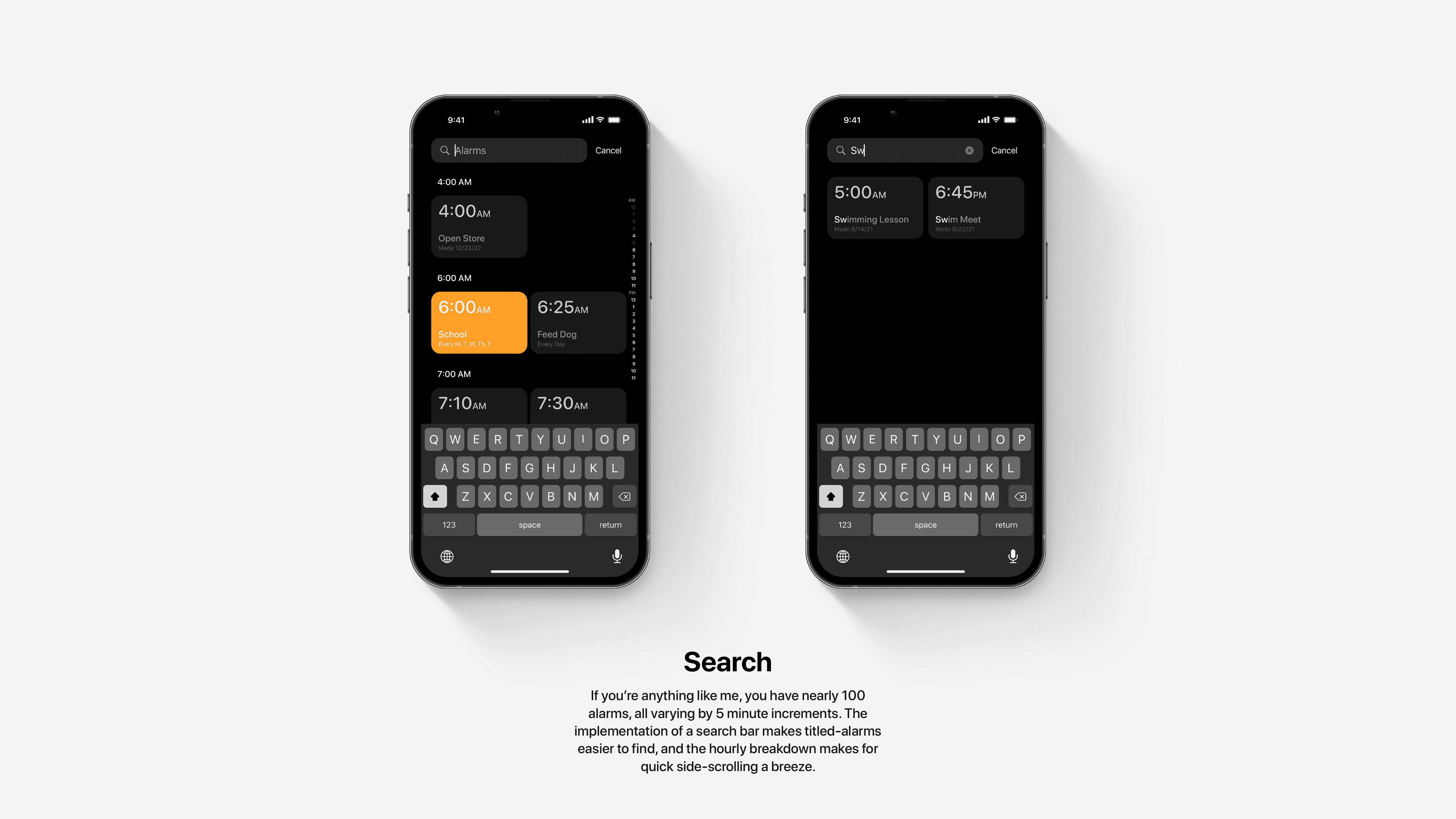
What I wanted was a change to this frustration with the ability to pin, search, and adjust my rest without needing to overload the app with ongoing ringtones.
The Solution
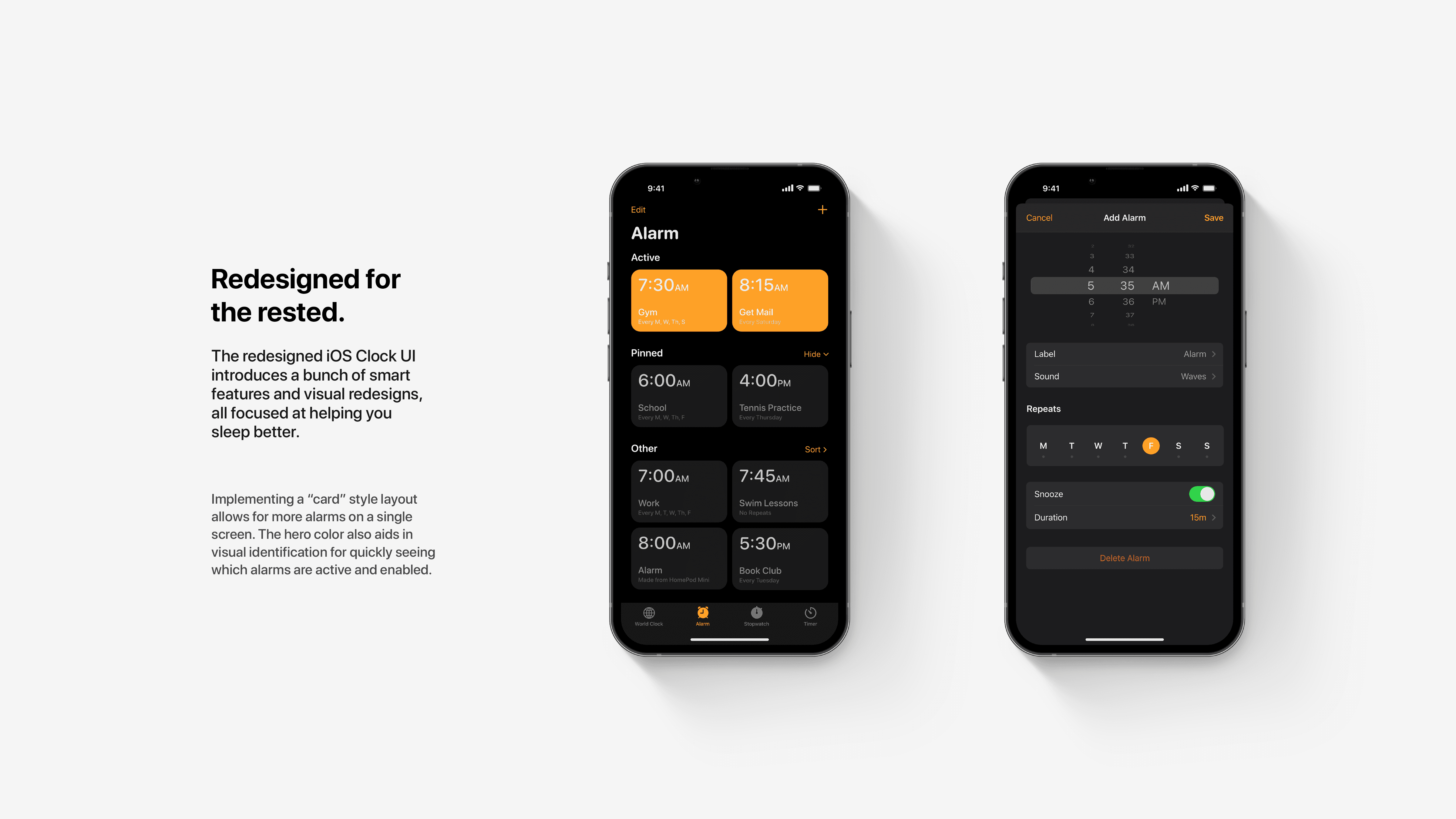
The redesigned iOS Clock UI introduces a bunch of smart features and visual redesigns, the first facelift since iOS 7. all focused at helping you sleep better.
The first was implementing a “card” style layout to replace the list of alarms, which allows for more alarms on a single screen. The hero color, now orange to match the CTA snooze button, also aids in visual identification for quickly seeing which alarms are active and enabled.
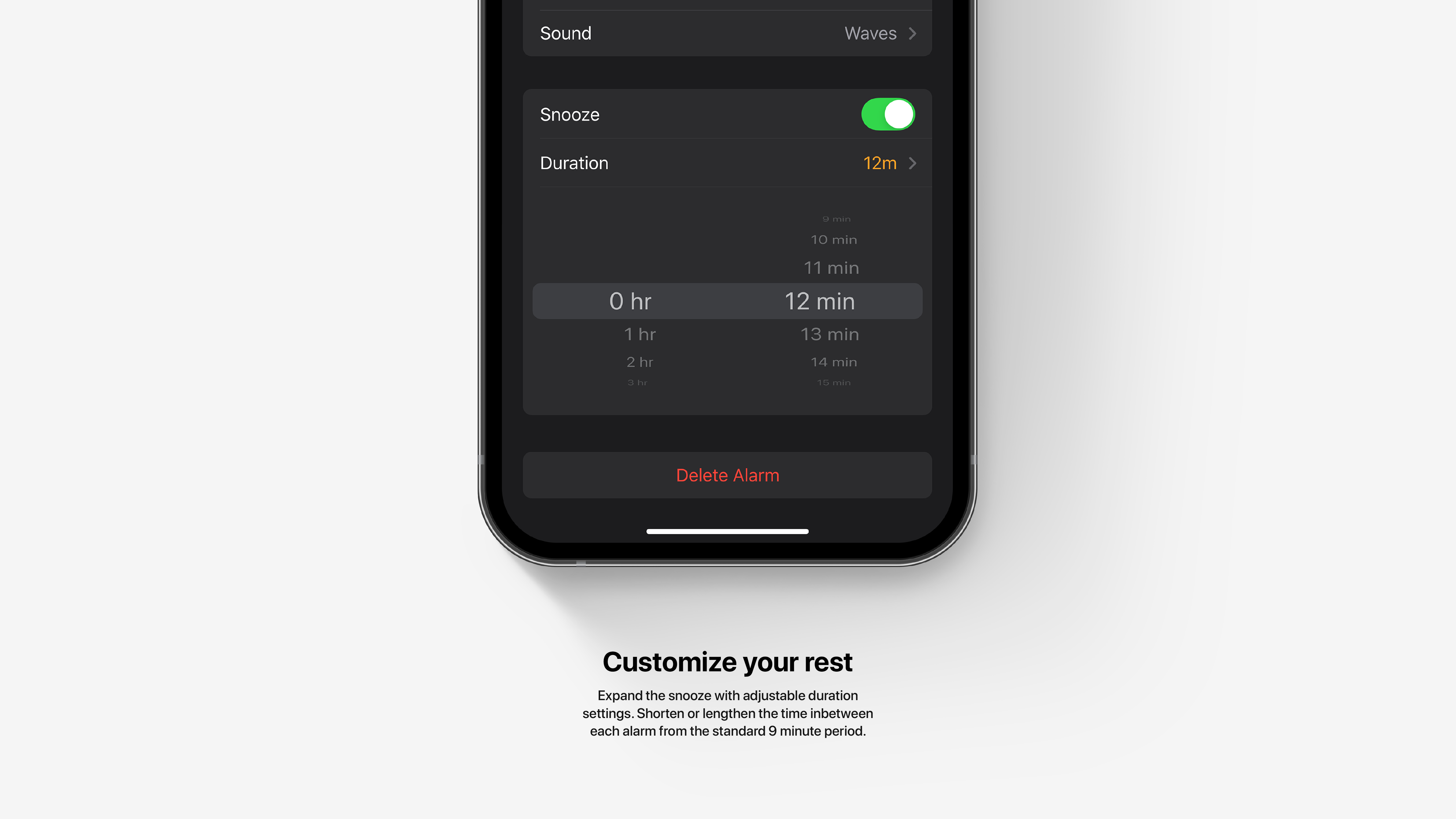
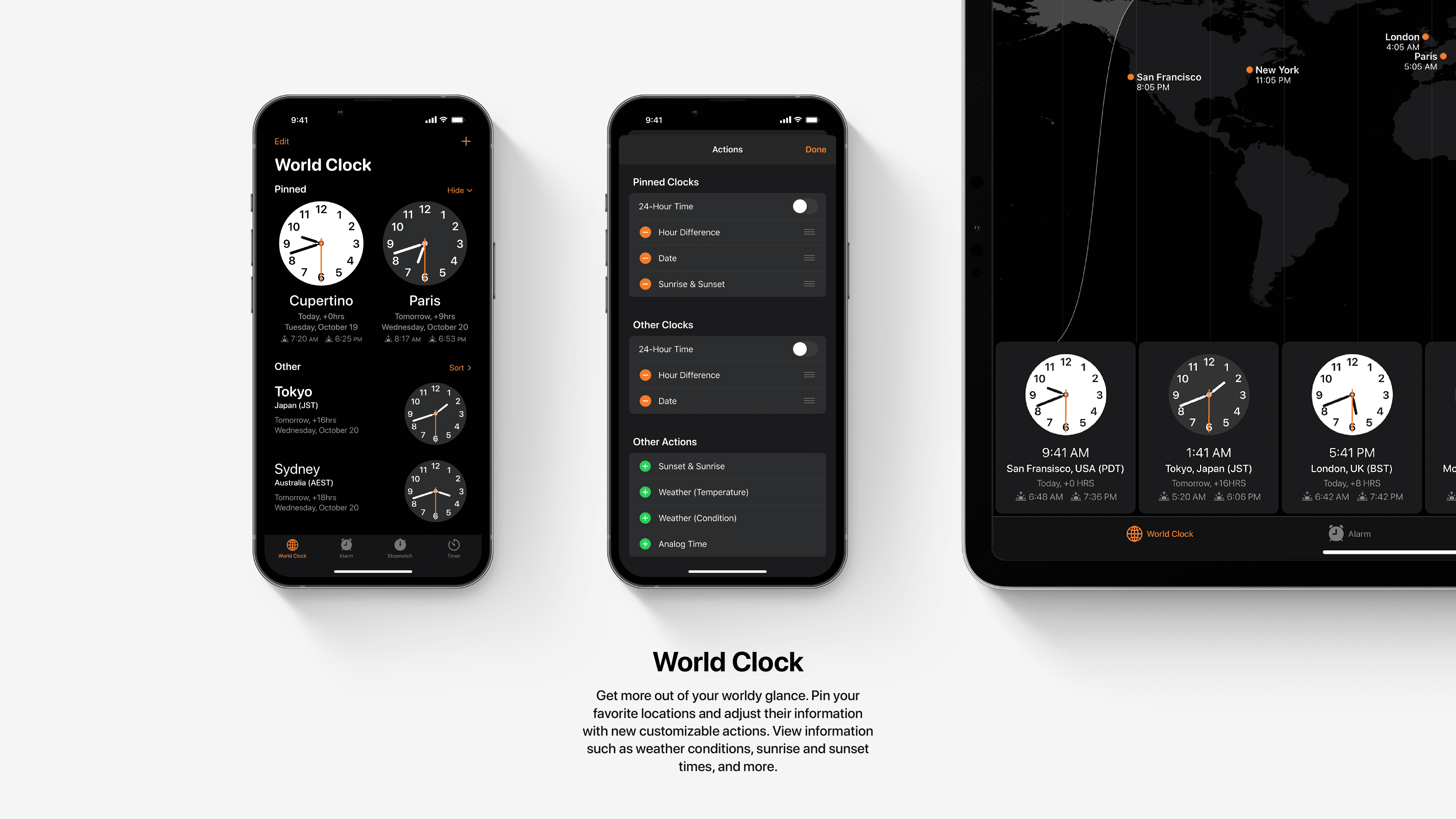
Customizations also make a comfy entrance to snooze timers, world clock information, as well as pinned alarms and editing tools.
